Top Five Mistakes to Avoid When Designing International Business Cards
Your business card is your brand. It’s a simple, yet effective tool for networking. These days, this simple tool is being used internationally more and more to build client contacts in a variety of countries. With so many style choices out there, it’s easy to overlook some basic rules when designing international business cards.
First and foremost, when creating business cards to use both here and abroad, it’s important to keep it simple. Understand that many people who may be viewing your business card may not be fluent in English, and/or use English as a second language. Thus, the most effective message is one that actually reaches its target. Keep this in mind and avoid these top five mistakes when designing your international business card.
1. Your Company Logo
Ensure that your company logo is clear and well displayed on your business card layout. This seems like it goes without saying, but we often see many logos that are too small, low quality, or not included at all on cards created for the overseas market.
We often get asked if the colors red and/or gold should be used for Chinese business cards, and whether a company logo should be altered to include red or gold colors. The short answer is: No. Your company logo is your brand. For branding purposes alone, your company logo should be left as-is. In most cases, any text found within this logo should also be left as-is. There are certain literal tag lines such as “Since 1925″ that can be translated, but in most cases, it’s best to leave your logo exactly as-is, even on translated business cards.
2. Select a Clean Font
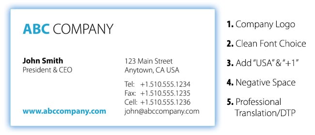
This could be the most important tip of this list. Again, when using business cards overseas, many of the recipients may use English as a second language. Thus, your business card is not the area to display your key contact information in a highly stylistic or unusual font. This is the time to select a clean, clear, legible serif or sans-serif font, and suppress the feeling of mixing too many different typefaces on the same card. In fact, the most effective international business cards are those which use a single font family, with a variety of weights. For example, in the sample image with this article, the font here is simply Myriad. However, the same font is used here with varying weights for style. (“John Smith” is in Myriad bold, where as the content is in Myriad light, etc.) This still provides enough variety and options to keep things creative, but reduces the clashing of typefaces that may not work together or be difficult to read for your international audience.
Font sizing is also extremely important. For example, when creating business cards for Asia, Asian fonts will be matched in size accordingly. Thus, for style, if one creates a business card that is to small to be read in English, it will be doubly difficult to read complex strokes and characters in Chinese, Japanese or Korean. Therefore, a general rule is that it’s best to avoid font sizing below 6pt for all content, with the ideal size being 8pt or above.
3. ‘USA’ and the ‘+1′ Telephone Country Code
For your mailing address, when using business cards internationally, it looks sloppy to not include your country or telephone country code on your business card. The addition of “USA” is simple, but often overlooked. For any telephone number within the USA, the proper way to add a country code is “+1″ and then the standard number. Often times we see the incorrect usage of “001″ or other variants along these lines, but these are not ideal. The unformed global standard is simply “+1″.
4. Don’t Forget the Negative Space
When creating business cards for international use, many clients try to cram as much information on a single side of the card as possible. This not only makes the card difficult to read, it often results in font sizes being too small, and/or text being too condensed to be read (see #2 above.)
Think of your business card as a small advertisement for your company. You want this “ad” to have enough information for someone to keep your card, but you don’t want it to be too busy and quickly discarded. Balance in design is the key, and it all begins with the negative space.
Another reason that negative space is highly important in international business card design, is that when translating your business card, you can use this negative space to accommodate any potential “translation expansion.” What is translation expansion? That’s the length of text that expands when your English message is translated into a variety of languages. Some target languages are about the same length as English, but other lines of text will need more space on your card for the exact same meaning. For example, Spanish or Russian text often runs 20-30% longer than the equivalent text in English. Thus, when creating the Englishversion of your business card, if your cram in the text and barely make it fit into the standard sized business card, this will be a problem when you ultimately translate your business card. Be sure to keep an adequate amount of negative space (or “whitespace”) on your card. Balance is the key.
5. Professionally Translate & Typeset your Business Card on the Back
Why waste an entire back side of your business card by leaving it blank? For international use, it’s an enormous benefit to your message to have your business card professionally translated and typeset into the target language for the country you are visiting. Especially in Asia, business cards are a representation of the person. Translating your business card into Japanese for example, can have a huge impact on the success of your first impression at your business meeting.
What about Google Translate? Well, if you have a single literal word, google translate can a great tool. But even then, how do you get that printed properly without Asian font issues, etc? How do you know it’s correct? Can you match the font and typeset your card so it keeps the same consistent look and design as your English original? This is where the professionals come in.
Stick with a company that specializes in not only business card translation, but one that has the fonts and typeface capabilities for non-latin characters needed for Japanese business cards, Chinese business cards and Korean business cards. These languages use character sets unlike English, and require font and typesetting professionals that need to apply unique rules for each target language. Insist that the company you select only uses professional native-language speaking translators to translate all material on your next set of international business cards.
For more information, please visit our Frequently Asked Questions page for ordering translated business cards.
You can also use our express FREE Asian Business Card Translation Quote Request Form to select your options and receive a detailed quote for your exact order.
_________________________________________________
AsianBusinessCards.com
Japanese, Chinese & Korean Business Card Translation, Typesetting & Printing Experts